Why Create a Real Estate App?
Why Create a Real Estate App?
Why Create a Real Estate App?
Real estate investment is an increasingly popular way for individuals to achieve financial security. It is an exciting and emotional experience, but often complicated.
While there are plenty of blogs and agencies providing information, often, buyers new to the market may struggle to get started without professional guidance and waste time viewing properties that do not work for them. This responsive web app will provide them with the expertise needed to get started efficiently.


Land & Key Objectives.
Land & Key Objectives.
Land & Key Objectives.
Develop a responsive web application that empowers property buyers by delivering comprehensive, user-friendly information on properties of interest, streamlining their real estate investment journey, and ensuring they make well-informed decisions.
Develop a responsive web application that empowers property buyers by delivering comprehensive, user-friendly information on properties of interest, streamlining their real estate investment journey, and ensuring they make well-informed decisions.

User Story
User Story
User Story
Persona: Rashida
As an IT consultant for a growing tech company, Rashida is frequently on the go and often holds meetings by phone in her car while driving. She is good at multitasking and relies heavily on technology to help her with this.
Goals:
- Rashida makes a good living and wants to invest in property beyond the city for increased financial security for her family.
- She wants to find the right information for fast decision-making.
- She wants a tool to help her find the right properties so as not to waste her time.
Quote:
“I want to provide my family with financial security. I’ve been considering buying property for a while, and am looking for a tool that can help me find what I’m looking for, quickly!”

What vibe are we going for ?
What vibe are we going for ?
What vibe are we going for ?
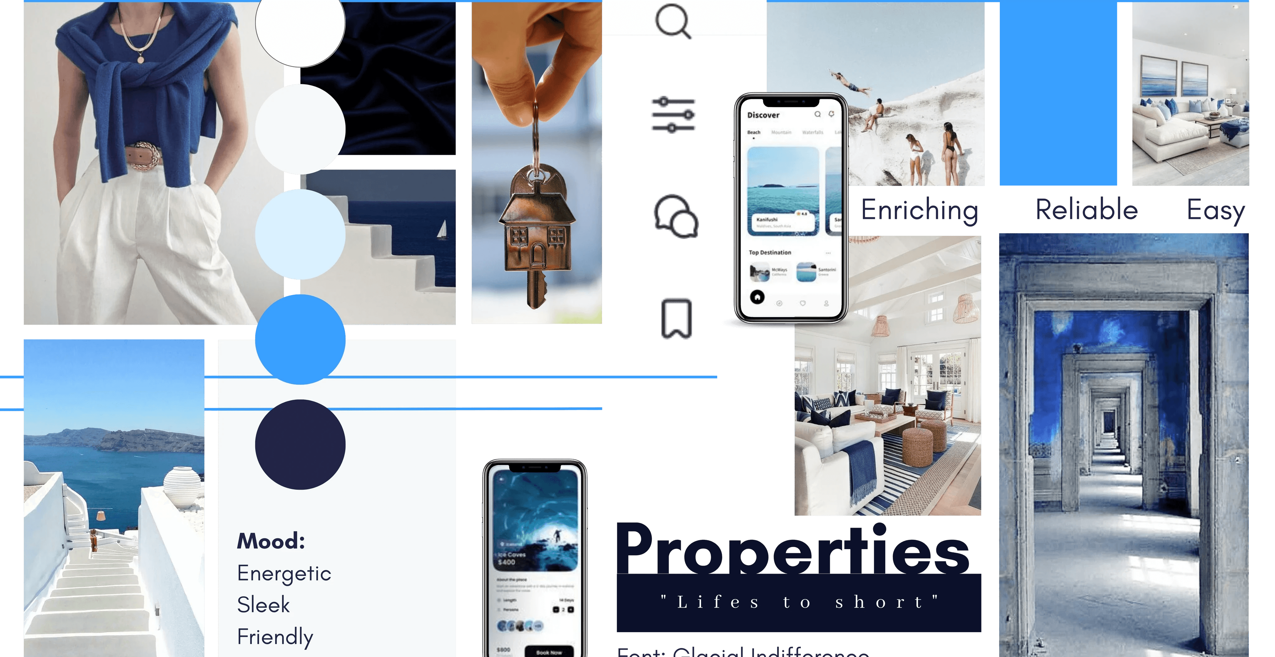
In crafting the mood board for the Land&Key real estate app, the aim was to establish a unified ambiance that seamlessly blends an energetic friendliness with a sleek, modern finish. The sleek design serves to contemporize the app, instilling a sense of trust in its reliability. Simultaneously, the energetic approach captivates users, encouraging them to return. Friendliness was achieved through the integration of user-centred features, ensuring that users feel enriched whether they're in the process of buying a home or seeking valuable real estate insights. This comprehensive approach to design and aesthetics ensures that the app not only looks appealing but also delivers an engaging and user-friendly experience.
In crafting the mood board for the Land&Key real estate app, the aim was to establish a unified ambiance that seamlessly blends an energetic friendliness with a sleek, modern finish. The sleek design serves to contemporize the app, instilling a sense of trust in its reliability. Simultaneously, the energetic approach captivates users, encouraging them to return. Friendliness was achieved through the integration of user-centred features, ensuring that users feel enriched whether they're in the process of buying a home or seeking valuable real estate insights. This comprehensive approach to design and aesthetics ensures that the app not only looks appealing but also delivers an engaging and user-friendly experience.
In crafting the mood board for the Land&Key real estate app, the aim was to establish a unified ambiance that seamlessly blends an energetic friendliness with a sleek, modern finish. The sleek design serves to contemporize the app, instilling a sense of trust in its reliability. Simultaneously, the energetic approach captivates users, encouraging them to return. Friendliness was achieved through the integration of user-centred features, ensuring that users feel enriched whether they're in the process of buying a home or seeking valuable real estate insights. This comprehensive approach to design and aesthetics ensures that the app not only looks appealing but also delivers an engaging and user-friendly experience.
Colour
Colour
Colour
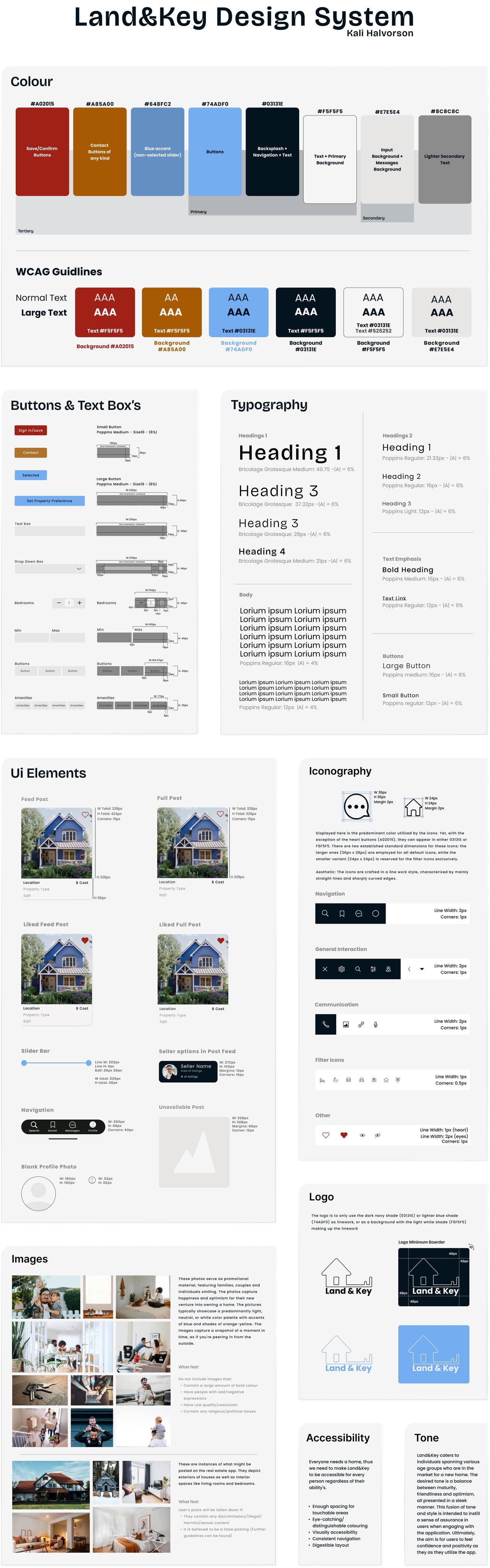
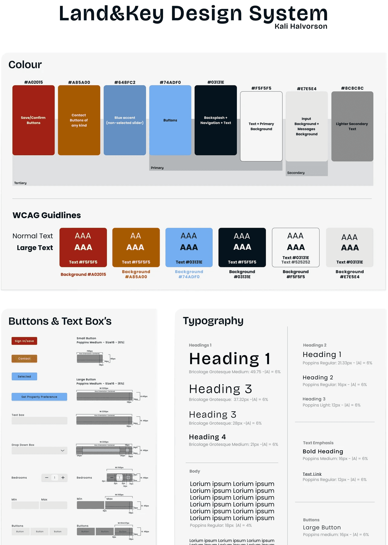
The dominant use of blue hues was chosen to evoke feelings of reliability and security, instilling confidence in users as they engage with the app. These colours were carefully selected to create a sense of calm and clarity, ensuring that users would feel comfortable and at ease while using the application.
Primary buttons are predominantly utilized on filtering pages. They tend to have a light grey appearance when unselected and transform into a vivid blue when selected. In contrast, the "Direct Message" and "Email" buttons adopt a tan-like colour. This tan hue, derived from a yellow-orange base, serves as a persuasive "call to action" colour, encouraging users to initiate contact with sellers. Its deeper shade complements the overall colour scheme while simultaneously mitigating the potential visual strain associated with lighter shades of yellow. The heart and save/confirm buttons maintain their red colour to emphasize their action-oriented significance.
To ensure accessibility and visual appeal, both the contrast and desaturated versions of these colours using WCAG guidelines were tested, all while adhering to the 60:30:10 design principle.

Low-Fidelity Wireframe
Low-Fidelity Wireframe

After better understanding the intended direction for Land & Key, I proceeded to create its low-fidelity wireframe. These wireframes utilized the user flow's previously created, while also building upon it when needed. This marked the beginning of defining the visual style of elements across the app.
After better understanding the intended direction for Land & Key, I proceeded to create its low-fidelity wireframe. These wireframes utilized the user flow's previously created,
while also building upon it when needed. This marked the beginning of defining the visual style of elements across the app.
Revisions
The low-fidelity wireframe for the Land & Key underwent analysis aimed at pinpointing potential usability challenges and areas of friction. Though Land&Key is a UI-focused project it's still grounded in the principles of user-centered design. Identified issues were systematically resolved through an iterative design process, guided by established design principles and best practices, ultimately culminating in the creation of the mid-fidelity design. Now, let's delve into the specific issues that were identified during this analysis and explore the corresponding solutions.
The low-fidelity wireframe for the Land & Key underwent analysis aimed at pinpointing potential usability challenges and areas of friction. Though Land&Key is a UI-focused project it's still grounded in the principles of user-centered design. Identified issues were systematically resolved through an iterative design process, guided by established design principles and best practices, ultimately culminating in the creation of the mid-fidelity design. Now, let's delve into the specific issues that were identified during this analysis and explore the corresponding solutions.

Users need a way to search for sellers
Users need a way to
search for sellers
Users need a way to
search for sellers
Allowing users to filter between seller profiles and properties.
Seller information appears briefly in a horizontal scroll every 12 posts on the main feed.
We've also created a dedicated "seller profiles" search page for users.
I incorporated these changes to meet users' need for finding nearby sellers, in line with industry standards and user expectations.

Sellers need a profile for users to view
Sellers need a profile for
users to view
Sellers need a profile for
users to view
Create a profile page for sellers where users can view their listings and personal information.
A new page has been added for the sellers' profile, showcasing all their information and listed properties.
Create a profile page for sellers where users can view their listings and personal information.
A new page has been added for the sellers' profile, showcasing all their information and listed properties.

Create minimum and
maximum component
Create minimum and
maximum component
Create minimum and
maximum component
Create a maximum and minimum textbox with a slider that reflects the slotted information.
Users need a more user-friendly and flexible approach for entering square feet and property costs to enhance ease and convenience.
Create a maximum and minimum textbox with a slider that reflects the slotted information.
Users need a more user-friendly and flexible approach for entering square feet and property costs to enhance ease and convenience.

Consolidate secondary listing aspects
into amenities buttons
Consolidate secondary
listing aspects into
amenities buttons
Consolidate secondary
listing aspects into
amenities buttons
Create buttons depicting secondary listing aspects users want a property to have.
To further cater to users' preferences and enhance their search experience, I implemented the amenity buttons which users can easily select to tailor their search results accordingly.
Create buttons depicting secondary listing aspects users want a property to have.
To further cater to users' preferences and enhance their search experience, I implemented the amenity buttons which users can easily select to tailor their search results accordingly.

Re-work top mobile buttons
Re-work top mobile
buttons
Re-work top mobile
buttons
Make the filter and search button uniform. Additionally, the sort button was revised to conform to industry standards, ensuring consistency and familiarity for users.
In response to users' need for an intuitive feed function within the app, I revamped the top section of the feed post to better cater to these requirements.

Add icons to the "About" section
Add icons to the "About"
section
Add icons to the "About"
section
To create a more cohesive and accessible amenities section, icons were paired with their corresponding amenities.
I improved the visually unappealing About section by connecting icons to corresponding amenities and information, enhancing both the visual appeal and accessibility for users.
To create a more cohesive and accessible amenities section, icons were paired with their corresponding amenities.
I improved the visually unappealing About section by connecting icons to corresponding amenities and information, enhancing both the visual appeal and accessibility for users.
After the revision process, the creation of a comprehensive design guide became the pivotal next step in preparing Land & Key for the transition from mid-fidelity to high-fidelity wireframe. This guide encapsulated refined design decisions, colour palettes, typography, spacing, and UI components, offering a clear roadmap for the design. It not only ensured consistency and cohesion in the app's visual identity but also facilitated efficient collaboration among potential team members, making it a crucial reference point.
After the revision process, the creation of a comprehensive design guide became the pivotal next step in preparing Land & Key for the transition from mid-fidelity to high-fidelity wireframe. This guide encapsulated refined design decisions, colour palettes, typography, spacing, and UI components, offering a clear roadmap for the design. It not only ensured consistency and cohesion in the app's visual identity but also facilitated efficient collaboration among potential team members, making it a crucial reference point.
See Full Design Guide
See Full Design Guide
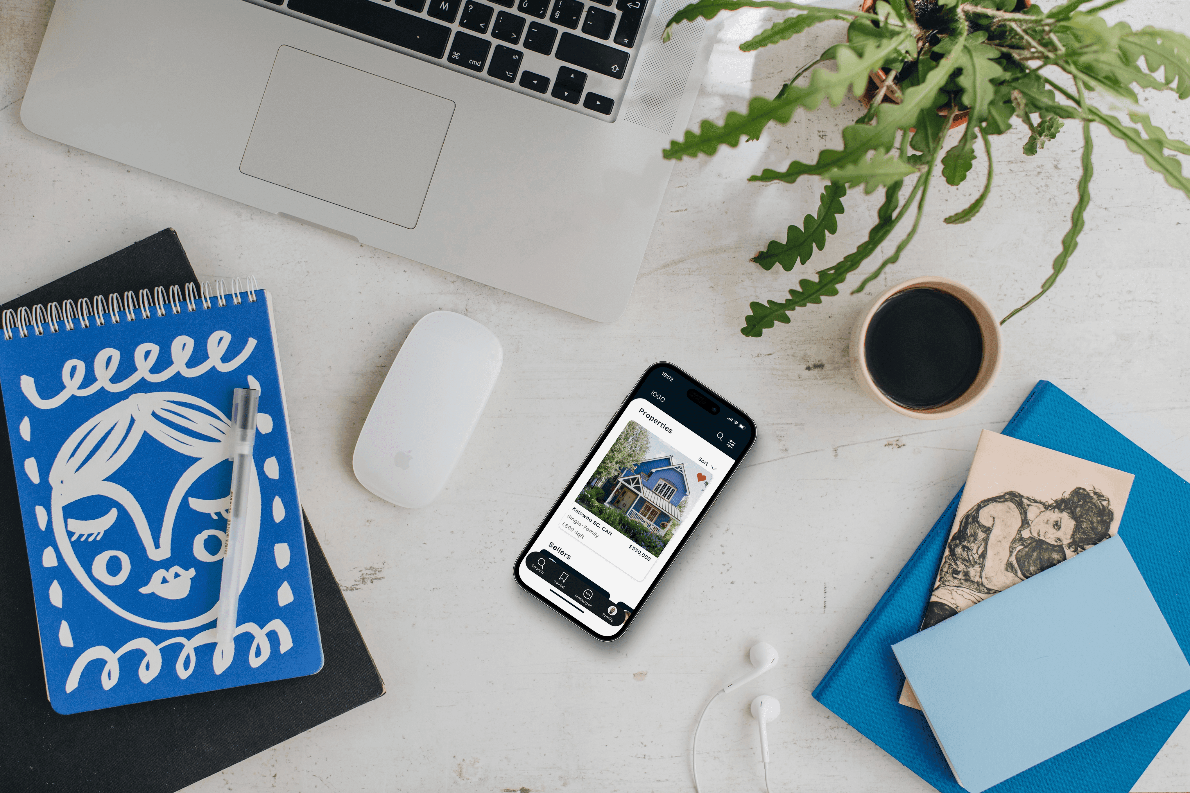
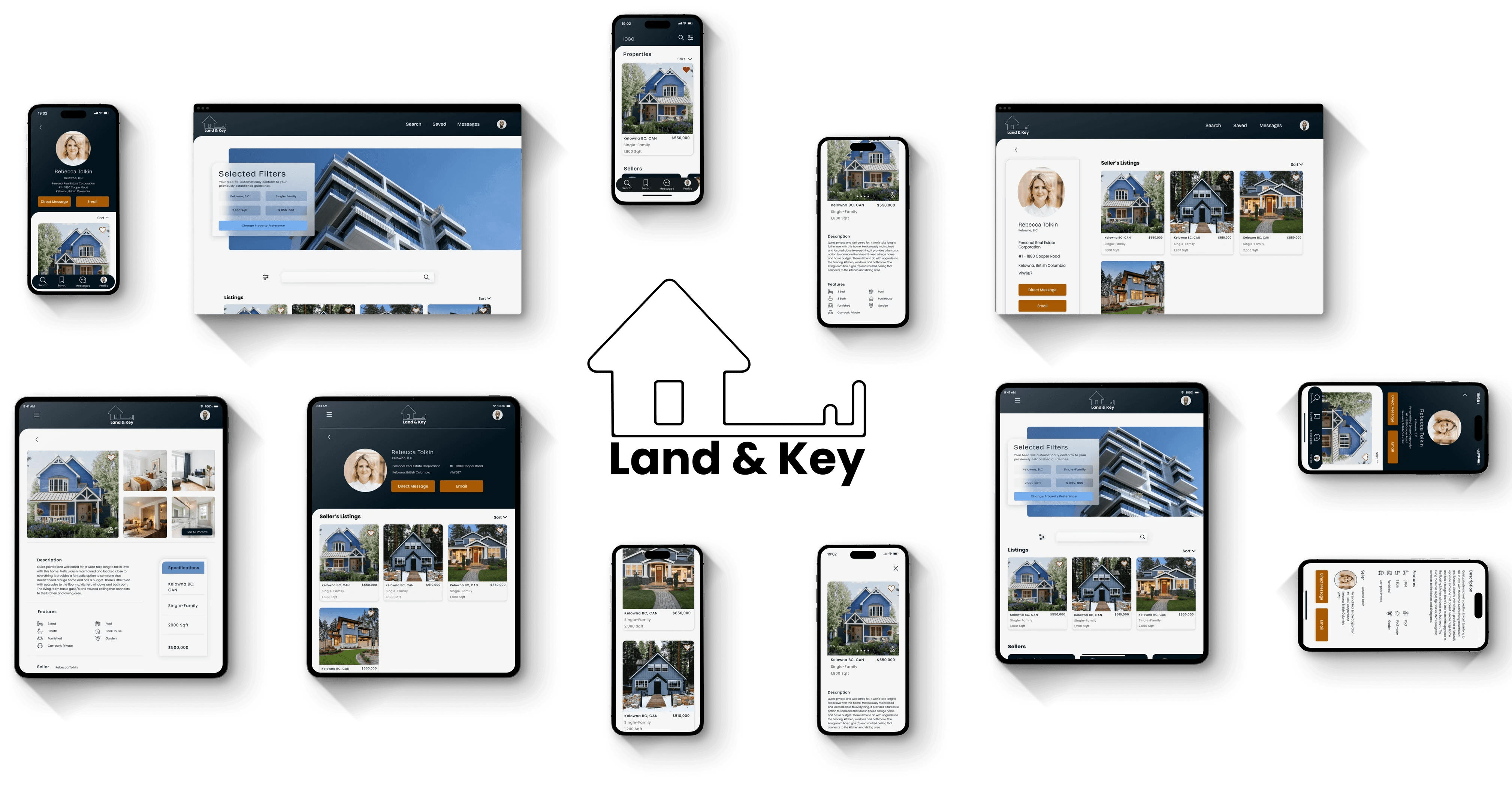
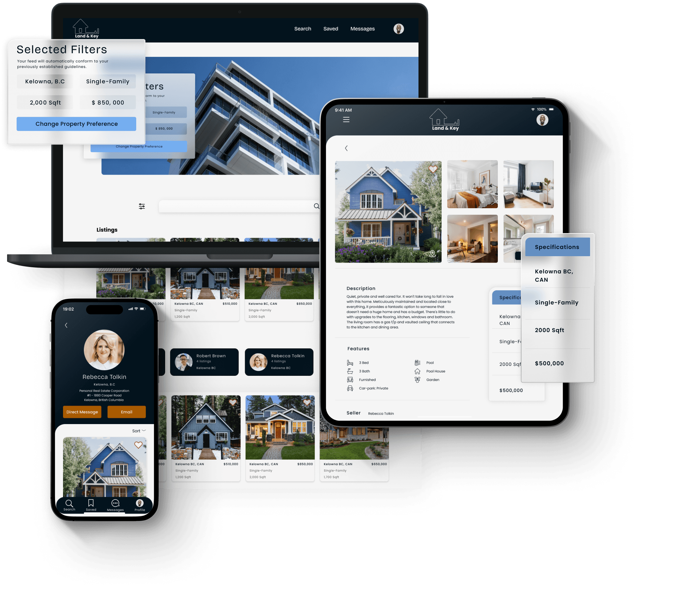
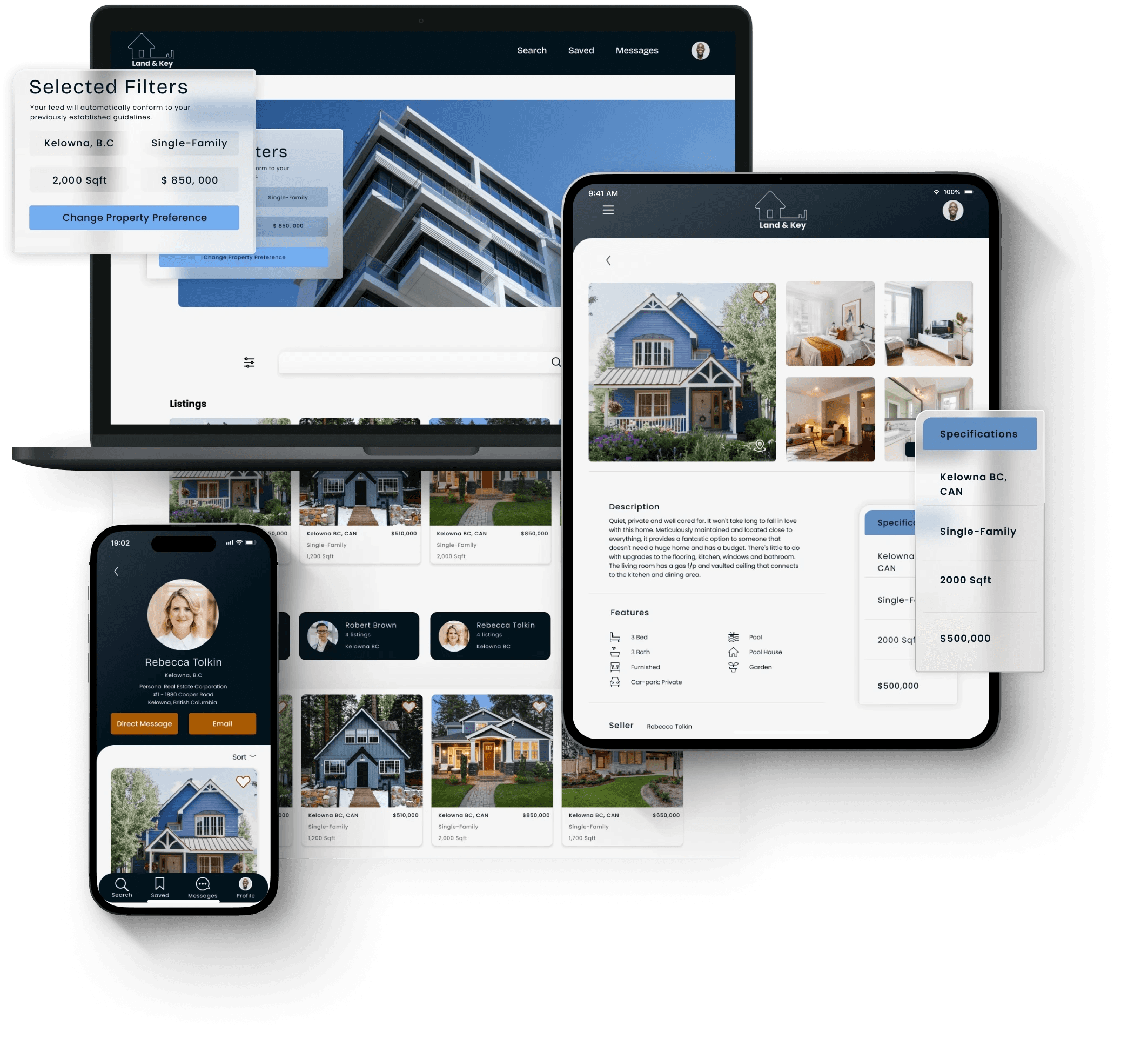
From Mobile
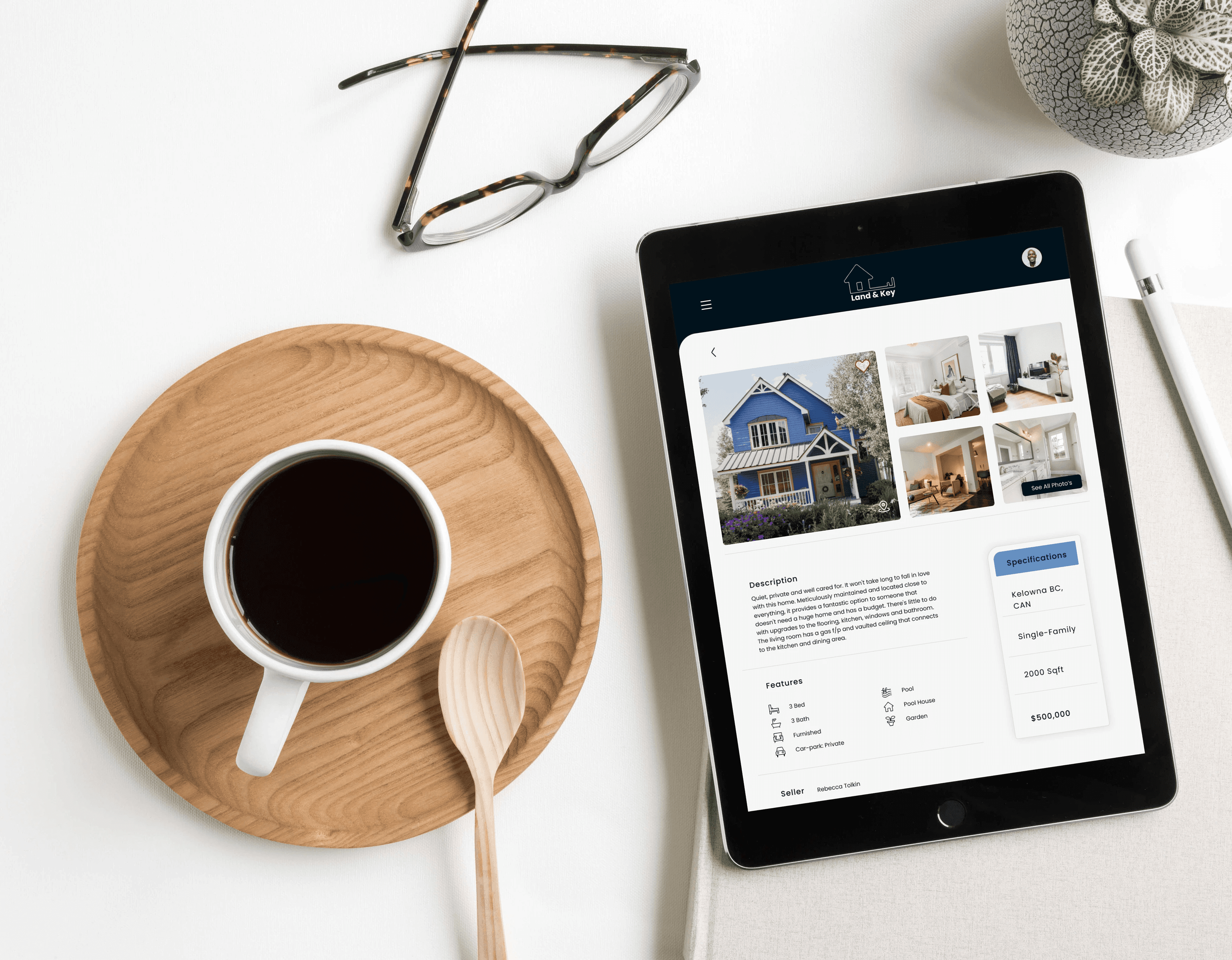
To Tablet
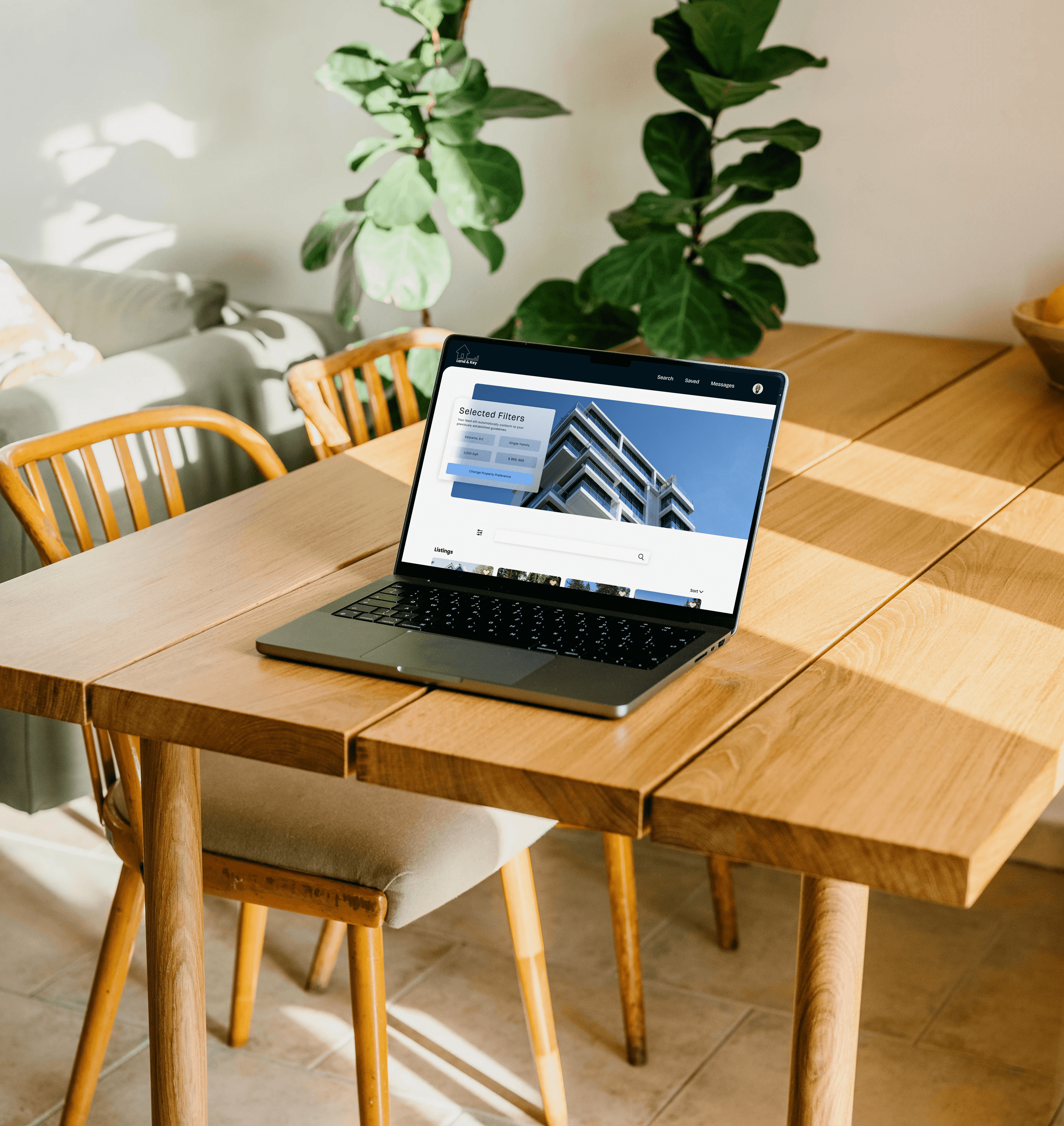
& Desktop
High-fidelity Wireframe
Having established a UX design system, I was equipped to create a high-fidelity wireframe more effectively. This system serves as a comprehensive framework that encompasses design principles, UI components, typography, colour schemes, and spacing guidelines. With these elements pre-defined and organized, I can seamlessly integrate them into the wireframe, ensuring consistency and coherence. This not only expedites the design process but also guarantees that the high-fidelity wireframe aligns closely with the established user experience vision.
Framer 2023
Amsterdam